that nauti life
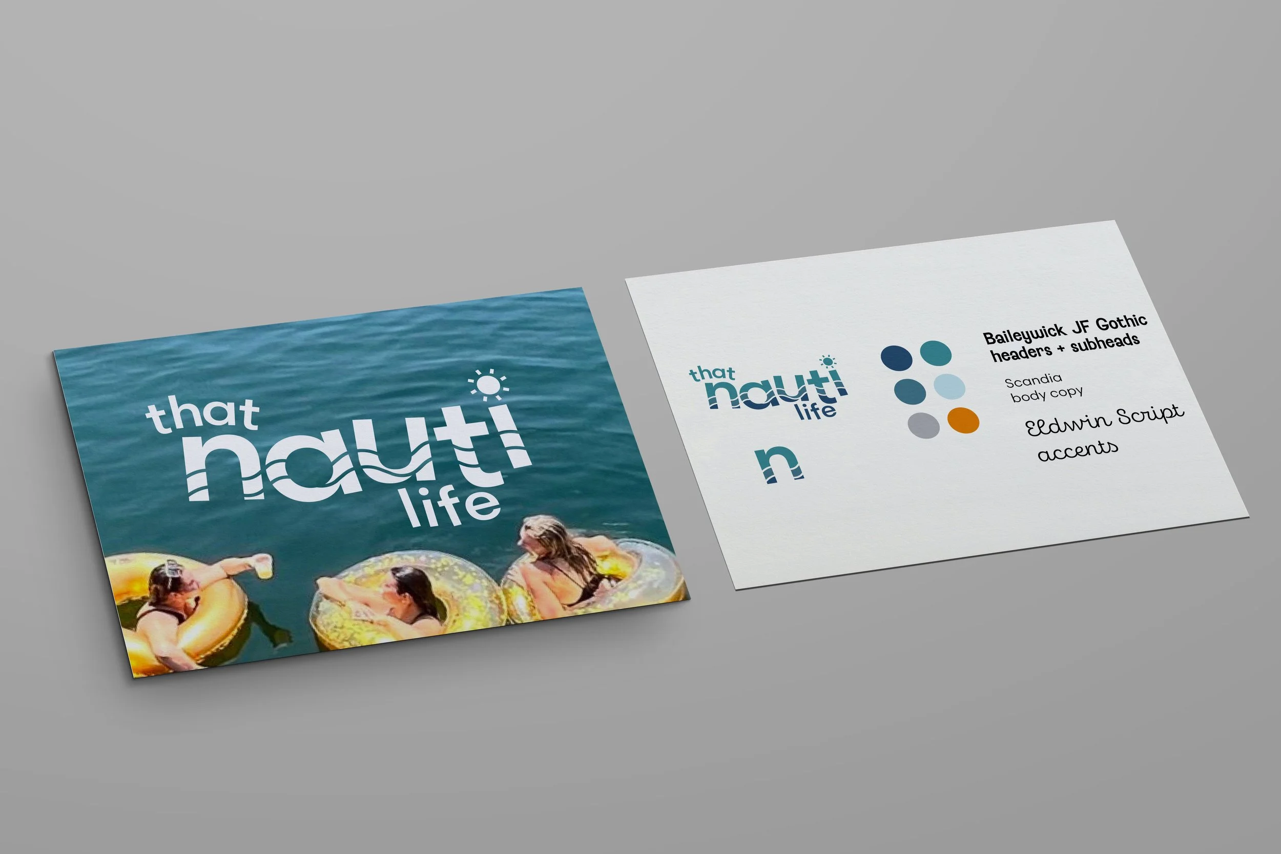
That Nauti Life is an apparal company based in Tennessee. They make merchandise targeting tourists in the area that enjoy the lake life in Knoxville, Chattanooga, and Norris. My client wanted to start out by building out the “parent” brand called That Nauti Life, which would be sold at any location. My client wanted a symbol that could be used throughout all sub-brands that represents the nautical lake life theme. I went with a simple “n” with a wave in the negative space that I carried throughout all sub-brands to make all merchandise and brands cohesive and recognizable.
scroll to see my process!


the process
the process

CONCEPT ONE
I started out with an all capital, bolded font to make “Nauti” be the emphasized word. I chose a typeface with rounded letters so the logo would have an organic feel, mimicking the idea of nature and water. I included two ocean waves in the negative space of the capital N to be used as a repeated icon throughout the brand family.
CONCEPT three
Concept three is the most upscale approach. This concept feels nautical, but used a sharper font with high contrast to give a more luxurious feel. I added a wave element in the “a” to still keep it light-hearted and appeal to younger audiences as well.
mood board
My client wanted to build a brand that represented the freedom and excitement that comes with summering on a lake. Her family loves water sports, boating, and hanging out by the lake. Her goal was to have a family of logos for her brand, That Nauti Life, that would expand to different cities in Tennessee. She wanted something family friendly, bold, aquatic, and wanted a key feature that could be used throughout the whole brand family. She also wanted to see different ideas appealing to different audiences. I began with a mood board finding inspiration that made me think summer on a lake. I spent a few summers boating on Lake Winnipesaukee in New Hampshire, so I could relate to that lake-life feeling and thrill of hanging out with friends.

CONCEPT two
Concept two is a more family-friendly, “childish” approach. I played around with twisting and turning some letters to mimic waves in the water, with the words “that” and “life” closely hugging the word “nauti.” I added some wave elements throughout the words as well as a small sunshine to the “i.” My client had a very specific color palette in mind, so I kept the colors very similar throughout all concepts.

narrowing it down
Choosing a direction
My client loved elements from both concept one and two. She preferred the lowercase rounded font (Scandia) combined with the simplicity in concept one. She especially loved the wave inside of the n and wanted to keep that element in this new concept. Now that we had a direction to move forward with, I gave her a few more choices for the wave in the “n,” getting into more detailed decisions and refining the logo.


Finally,
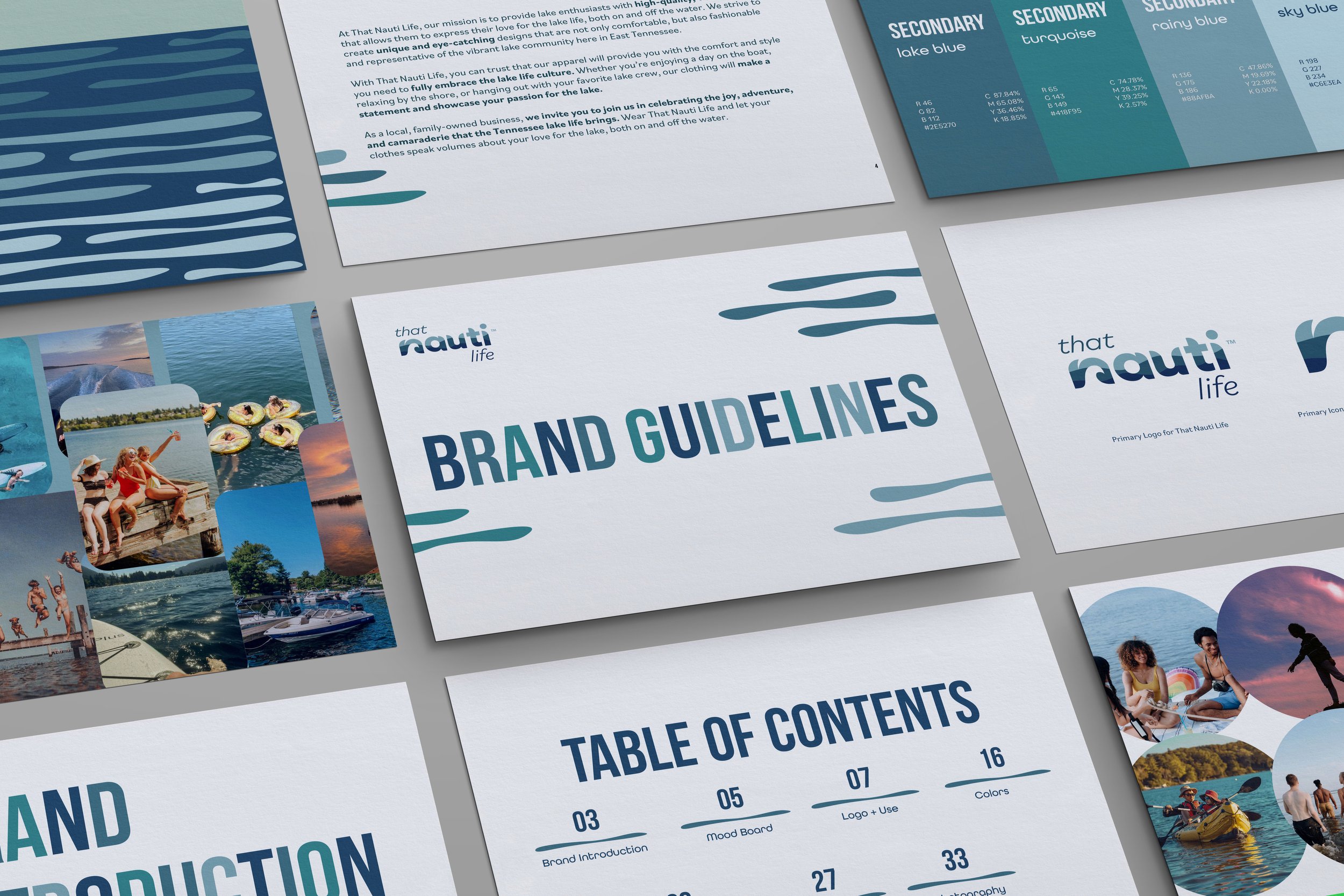
brand guidelines
Click on the image to see the full Brand Guidelines PDF.